How to read the Wind Forecast Graphs
Did you know that the arrow colours are reversible?
This site was originally built for Windsurfers & Kitesurfers - where strong wind is a good thing, so green=strong wind.
If you fish or surf, then light wind is a good thing, so .. red=strong wind.
How to work out the Wind Speed
The most recent live reading is at the right hand end of the graph, and up to 12 hours history extends towards the left - check out the time label at the bottom of each graph.Arrows indicate the strength by their Height on the graph and the colour of the arrow:
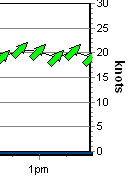
 Green Arrows indicate Strong wind, which is 17+ knots, 30+ Km/H, Force 5 or more. This graph shows an 18 to 20 knot southwester around 1pm |
 Yellow Arrows indicate Moderate wind, which is 11-16 knots, 20-29 Km/H, Force 4. This graphs shows a 14 to 16 knot southwester around 2pm |
 Red Arrows indicate Light/No wind, which is 0-10 knots, 0-19 Km/H, Force 3 or less. A 7 to 9 knot easterly around 8-9am |

Brown Arrows indicate, um .. 'soil your dacks' weather. A running joke here for years, we finally made them live. Nothing beats a solid 35+ knots, and to be out in it as a kiter/windsurfer is really exciting stuff, but without a doubt there a moments when you might fill your shorts. Let alone if you're out in a small boat in these conditions. Indicates wind 35 knots+ |
| Symbol | Term | Knots | km/h | Beaufort |
|---|---|---|---|---|
|
|
Light | 0 to 10 knots | 0-19 km/h | Force 3 or less |
|
|
Moderate | 11 to 16 knots | 20-29 km/h | Force 4 |
|
|
Fresh & Strong | 17+ knots | 30+ km/h | Force 5-7 |
|
|
Gale | 35+ knots | 60+ km/h | Force 8 and above |
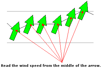
The Middle of the arrow is where you
should read the wind speed from the scale at the sides. Picture the arrow as
being like a compass needle, where it rotates around a central point of
balance.

The Grey arrows
indicate the maximum gust during the 10 minute period.
Time of day is displayed along the
bottom of the graph.
The site was initially designed for Windsurfers,
so the colours use a Traffic Light type colouring, which may be the opposite of
your needs .. especially if you surf! On the website, reverse the colours by clicking
the 'Reverse Arrow Colours' link under the forecast graph, or, in the Apps, there is an
Arrow icon at the top of the Graphs screen which will get it done.
For most locations, the wind strength and
direction is the result of a 10 minute average
How To Read The Wind Direction
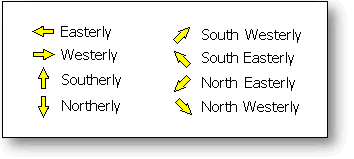
 The
arrows indicate the direction the wind is going based on North being at
the top of the screen and West being at the left.
The
arrows indicate the direction the wind is going based on North being at
the top of the screen and West being at the left.This concept confuses some people first off, because they are expecting the arrows to work like a weather vane and point towards the arriving wind.
It can also be confusing if you're looking at your computer monitor in a Southerly direction, as all the directions will be reversed.
We had to choose whether the arrows were indicating where wind went, or where it came from.
We figured that most things in life, such street signs (e.g. one way signs), swell direction arrows and traffic cops all point in the direction that something is going.
Pointing where the wind is going also makes good sense when the arrows are overlaid over a map (..see demo)
Take a "Northerly" wind, for example. "North" is at the top of the screen (as maps generally have their northmost point at the top), and a "Northerly" is a wind that travels from the North to the South, so it is drawn as an arrow that points down - that is, pointing from North to South.
Easterly Example: An easterly wind heads from the east (right side of the screen) towards the west (left side of the screen), so the arrow is drawn pointing to the left.
Sunrise & Sunset
The grey shaded area of the graphs indicate night time. The graphs are live 24 hours are day and always display the most recent 8 hours of live wind data. You can also view yesterdays full 24 hour history by clicking the "Yesterday" link located in the left hand menu.The graphs below show the progress of an awesome West Australian seabreeze, and displays from Midnight to Midday
As illustrated by the grey gradient, Sunrise was at 5:32am

In the graph above, you can see the seabreeze arriving at 10:30 am where it shifts from a SE to a SSW.
The graph below is 8pm later the same day, and shows the previous 12 hours to 8am.
The grey gradient at the right indicates night is approaching (sunset was 7:32pm)

This particular day was an amazingly consistent 20 knot southwester which continued right through past midnight...interesting change of direction from SSW to S once the sun went down...

All times are aligned!
 |
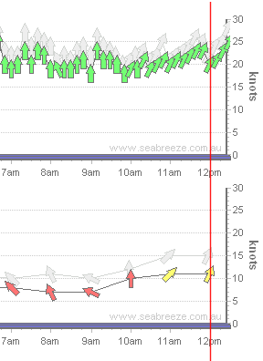
In the example graphs below, the wind graph at the top has readings every 10 minutes, whilst the graph underneath
every hour. The Time axis of all the graphs on the same page always align vertically. We've drawn the red line over the graphs to show how the times line up. This example shows two graphs at 12:30 pm. As the lower graph only reports on the hour, there is a gap to show the time since the last report. The upper graph has data every 10 minutes. Stations that report hourly will have a gap at the right hand side due to the lower reporting period, and this makes it easy to verify the latest readings. |
The red line shows how all the graphs times align.
About Weather ForecastingWhilst the forecasts are generally very accurate, they are not 100% accurate, 100% of the time. Just like your luck, the weather can change in an instant! When the weather is not as the forecast predicted, the tendency is to blame the forecast. We'd like to suggest that the forecast is accurate as it possible can be, it's the weather that changed! Let's think about how a forecast is generated. The first step is to collect real observations from around the globe so that you can feed past weather and current weather into the computer model that generates the forecast. Weather observations are sourced from many places, such as the daily release of a weather balloon which measures the air pressure a various altitudes. (There's more to forecasting, than just sea level) Other sources include ships which are part of a world data collection system that take weather observations such as temperature, air pressure, wind direction and speed and radio them in to a central collection point. There are also weather buoys that freely float the currents of the ocean and automatically radio their observations in. Similar concept on solid ground - land based weather stations automatically collect weather data and radio the information in - no human help required. There will always be areas of the atmosphere where no local observations have been collected. These areas are calculated using sophisticated estimation systems to use surrounding observations to calculate what's going on in the area without any observations. The computer model then uses historical data, current data and local knowledge to predict what the weather is most likely to do next - a forecast. The forecasts are regenerated every 6 hours, and the graphs are updated here moments later. The further out the forecast is (e.g. 7 days) the less chance it has of being accurate due to the chaotic nature of weather. How to read the Wind & Wave Forecast graphUnlike the live graphs which represent part of a single day, the forecast graphs cover 7 days. Each "forecast" arrow is three hours apart from the previous arrow, representing a forecast wind speed/direction and swell every 3 hours of the day for 7 days in advance.
How to read the Wave Direction & Peak Period Forecast graph
Wave direction is the direction the swell is travelling. As every spot where waves break has a unique coastline, it represents a general indicator of the swell direction prior to being influenced by things such as groins, reefs, points and bays etc. Peak Period is an estimate of the average time (in seconds) between peaks. As a general indicator, the longer the period, the more powerful the swell. For example, 9-12 seconds may indicate wind waves while powerful swells have a period longer than 15 seconds. Bigger periods will also indicate faster moving swell. For example, a 2 metre swell @ 22 seconds can travel at over twice the speed of a 2 metre swell @ 9 seconds. Just like the other graphs, the centre of the arrow indicates the point where the value should be read from. Each increment at the base of the graph is a 4 hour period, with the longer bar on the "day" axis indicating midnight. |
How To Read The Tide GraphsWhat causes a Tide?Gravity! Water stays on our planet due to gravity. As the Moon orbits the Earth, it pulls the sea water towards itself. The Sun provides a similar effect, and as our distance from the Sun changes during the year, this also affects the tides.Sophisticated algorithms are used to compute the tide levels based on the rotation of the Earth, and the position of the Sun and the Moon, and our distance to the Sun. Predicting tides also relies on knowledge of "harmonics". Hundreds of tide monitoring stations (which are usually mounted on a jetty or other stable structure) measure the real water level. If a massive body of water is pulled one way, then the other, and all the while bouncing of sea walls and beaches, you can imagine how it can affect the calculations. So, from these real readings, the harmonics can be deduced which are then fed into the tide equations to assist in predicting tides. Tsunami's, strong wind, swell and storm surges will all affect the level of water experienced at your local spot. What use is Tide information!?Waves!The tide graphs are handy for surfers, windsurfers and kitesurfers - anybody who likes to hit a wave now and again. Tides can have a huge effect on the swell. A wave is caused by the shallowing of the ocean floor as a force of water approaches it. The only way "out" for the energy in the water is up .. thus a wave is created. Thats why waves don't generally break in the open ocean, but do tend to break over shallow areas of water such as reefs and beaches. Reef breaks can be some of the most powerful waves due to the sudden change of depth. This is where the tide comes into it...if there's a 2 metre swell and there's going to be a 1 metre high tide, then that's going to take some of sting out of the swell, because there may be an additional 1 metre of water depth. (Remembering that the reef/beach may not necessarily be at "mean sea level") However, if it's low tide (say 10cm), then that 2 metre swell is going to be a lot more exciting! Fishing! You can't mention tides without mentioning fishing! Many fish become active on a change of tide .. the changing currents can stir fish into life meaning they'll jump on your hook more readily. Because high tide adds extra depth, it can change which areas fish can feed in - fish can head into areas that were inaccessible on a low tide. The "Live" tide graph is not from real observationsThinking of heading out to go fishing or hit the surf and want to know what level the tide is up to?The tide graph at the bottom of each page is plotted from the tide predictions and is there as a convenience so you can see a close-up view of the tidal activity - it is not taken from real tide readings in the ocean. |

